Impact your audience by maximizing the use of data visualization in your presentations. Enhance the effectiveness of your message by incorporating compelling charts, graphs, and infographics. By leveraging visual aids properly, you can capture and maintain the attention of your audience, making your data more engaging and memorable. Follow these expert tips to ensure your presentations leave a lasting impression and drive your points home with clarity and conviction.

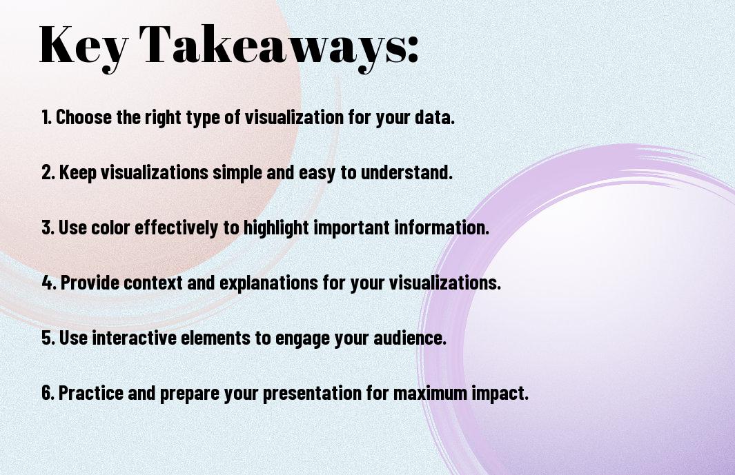
Key Takeaways:
- Know your audience: Understanding who will be viewing your data visualization is crucial to tailoring your presentation effectively.
- Keep it simple: Avoid clutter and focus on conveying your message clearly and concisely through visual elements.
- Use the right visualizations: Choose the appropriate charts, graphs, or infographics that best represent your data and help tell the story.
- Highlight key insights: Emphasize the most important findings or trends in your data to guide the audience’s attention.
- Design for readability: Ensure your visuals are easy to read by selecting appropriate colors, fonts, and layout for maximum impact.
- Practice good data storytelling: Frame your data visualization within a narrative structure to engage your audience and make the information memorable.
- Solicit feedback: Seek input from others to improve your data visualization and presentation skills for future engagements.
The Power of Visual Storytelling
Your presentation is a reflection of your ability to communicate effectively with your audience. In today’s fast-paced world, capturing and maintaining your audience’s attention is more challenging than ever. One powerful way to Visually Maximize Your Presentation Impact is through the power of visual storytelling. By integrating compelling visuals that tell a story, you can engage your audience on a deeper level, making your message more memorable and impactful.
Why Data Visualization Matters in Presentations
To truly make an impact with your presentations, leveraging data visualization is imperative. Data visualization transforms complex data sets into easily digestible visuals, allowing your audience to quickly grasp key insights and trends. In a world inundated with information, visuals have the power to cut through the noise and communicate your message effectively. Whether you’re presenting sales figures, market trends, or survey results, incorporating data visualization will help you convey your information in a compelling and memorable way.
The Cognitive Benefits of Visual Communication
For decades, researchers have studied the cognitive effects of visual communication on the human brain. The results are clear: visuals not only improve comprehension but also enhance retention. When you integrate visual elements like charts, graphs, and infographics into your presentations, you’re tapping into the brain’s natural ability to process visual information more efficiently. This means that your audience is more likely to remember and act upon the information you present when it’s accompanied by compelling visuals.
With the average attention span dwindling, engaging your audience’s visual senses is more important than ever. Visual storytelling not only captures attention but also fosters a deeper connection with your audience. By appealing to both the logical and emotional sides of the brain, you can create a presentation that resonates and drives your message home. So, when preparing your next presentation, remember the power of visual storytelling in maximizing your impact and leaving a lasting impression on your audience.
Setting the Stage for Effective Data Visualization
It is crucial to set the stage for effective data visualization in presentations to ensure that your message is impactful and clearly conveyed. Before venturing into creating charts and graphs, there are necessary preliminary steps you should take. Understanding your audience and their needs is the first step in crafting a presentation that resonates with them.
Knowing Your Audience and Their Needs
One of the most critical aspects of delivering a successful presentation is knowing your audience and what they hope to gain from your presentation. Are they experts in the field or beginners? What level of detail are they looking for? By answering these questions, you can tailor your data visualization to meet their specific needs. It is important to consider the preferences and knowledge level of your audience to ensure that the visualizations you choose are appropriate and understandable to them.
Additionally, understanding the context in which your audience will be viewing the presentation is necessary. Are they viewing it in a boardroom on a large screen, or are they reviewing it on their mobile devices? This information can help you optimize your visuals for the viewing platform, ensuring that your data is presented in the most effective way possible.
Defining the Purpose and Scope of Your Presentation
Their success of your data visualization hinges on your ability to define the purpose and scope of your presentation clearly and concisely. Before you start creating visualizations, take the time to outline the key objectives you want to achieve and the main takeaways you want your audience to grasp. By having a clear purpose in mind, you can ensure that every visualization you create serves that purpose and contributes to the overall message you are trying to convey.
Purpose
Understanding the purpose of your presentation will guide you in selecting the most relevant data to include and determining the appropriate visualizations to use. Whether you aim to inform, persuade, or inspire, aligning your visuals with your presentation goals is necessary to maximize their impact and ensure that they enhance your message effectively.
Choosing the Right Visualization Tools
Overview of Popular Data Visualization Software
Keep in mind that when it comes to data visualization software, there are numerous options available to help you create impactful presentations. Some popular tools include Tableau, Microsoft Power BI, Google Data Studio, and Python libraries like Matplotlib and Seaborn. These tools offer a wide range of features and capabilities to help you visualize data in insightful ways.
Tableau is known for its user-friendly interface and interactive dashboards, making it easy for you to create visually appealing charts and graphs. On the other hand, Microsoft Power BI is widely used for its seamless integration with Microsoft products and advanced data modeling capabilities. Google Data Studio is great for collaborative projects and real-time data visualization. Python libraries like Matplotlib and Seaborn are highly customizable and offer advanced data visualization options for those familiar with programming.
Before choosing a specific tool, consider the complexity of your data, your audience’s preferences, and your technical expertise. Each software has its strengths and weaknesses, so it’s imperative to select one that aligns with your data visualization goals and message.
Selecting the Best Tool for Your Data and Message
Visualization tools should be selected based on the type of data you have and the message you want to convey. For example, if you are presenting sales data over time, a line chart in Tableau or Microsoft Power BI might be the most effective choice. On the other hand, if you are comparing different categories within a dataset, a bar chart in Google Data Studio could be more suitable.
This step is crucial as choosing the right tool can significantly impact how your audience interprets the data presented. By selecting a tool that enhances the story you are trying to tell, you can positively influence the impact of your presentation and ensure that your message is effectively communicated to your audience.
Crafting Compelling Visuals
Not all data visualizations are created equal when it comes to maximizing impact in presentations. Crafting compelling visuals is vital to effectively communicate your data insights and engage your audience. In this chapter, we will explore key principles for creating visually appealing and informative data visualizations that leave a lasting impression.
Principles of Effective Color Use in Data Visualization
Color plays a crucial role in data visualization, as it can help differentiate categories, highlight trends, and evoke emotions. When choosing colors for your data visualizations, consider using a consistent color scheme to maintain coherence across different elements. Utilize color contrast strategically to emphasize important data points and ensure readability. Remember that color blindness is a common condition, so it’s vital to use colors that are distinguishable for all viewers.
The Role of Typography in Enhancing Data Insights
Visualization is not just about the visuals; typography also plays a significant role in enhancing data insights. Selecting the right typeface and font size can improve readability and hierarchy in your data visualizations. Consider using bold or italic styles to call attention to key findings. Additionally, white space around text elements can help reduce clutter and guide the viewer’s focus.
Principles such as consistency in font choices, sizes, and styles, as well as alignment and spacing, are vital for creating visually impactful data visualizations. By paying attention to typography details, you can elevate the overall design of your presentations and make your data insights more accessible and engaging to your audience.
Working with Different Data Types
Unlike textual data, which can be challenging to process and interpret, quantitative data and qualitative data offer unique opportunities for effective visualization in presentations. When working with different data types, it’s vital to understand the best practices for maximizing the impact of your data visualization.
- Quantitative Data
- Qualitative Data
This approach can help you convey your message more clearly and engage your audience effectively.
| Visualizing Quantitative Data: Best Practices | Effective Strategies for Visualizing Qualitative Data |
| Utilize charts and graphs to represent numerical values accurately. | Use word clouds or thematic maps to illustrate patterns and trends in qualitative data. |
| Avoid clutter and ensure that your visuals are easy to read and understand. | Employ color coding and grouping to highlight key themes or categories. |
| Choose the appropriate type of visualization based on the nature of your quantitative data. | Include captions or annotations to provide context and explanations for qualitative data visuals. |
| Use interactive visuals for complex quantitative data sets to allow for deeper exploration. | Consider the emotional impact of your visuals when presenting qualitative data to evoke empathy or understanding. |
| Ensure consistency in your visual design to enhance the overall coherence of your presentation. | Explore creative visualization techniques such as storytelling or metaphorical representations for qualitative data. |
Visualizing Quantitative Data: Best Practices
Best practices for visualizing quantitative data involve using charts and graphs that accurately represent numerical values. It’s vital to avoid clutter and ensure that your visuals are easy to read and understand. Choosing the appropriate type of visualization based on the nature of your quantitative data can significantly enhance the clarity and impact of your presentation. Additionally, utilizing interactive visuals for complex data sets can allow your audience to explore the data in more detail, enhancing their engagement with the information.
Effective Strategies for Visualizing Qualitative Data
In terms of visualizing qualitative data, effective strategies include using word clouds or thematic maps to illustrate patterns and trends. Employing color coding and grouping can help highlight key themes or categories within the data, making it easier for your audience to identify and understand the information presented. Captions or annotations can provide context and explanations for qualitative data visuals, enhancing the overall narrative of your presentation.
Plus, consider the emotional impact of your visuals when presenting qualitative data. By evoking empathy or understanding through creative visualization techniques such as storytelling or metaphorical representations, you can create a more compelling and memorable presentation that resonates with your audience. Remember to maintain consistency in your visual design to ensure coherence and clarity throughout your presentation.
Creating Interactive and Dynamic Visualizations
Once again, you have the opportunity to take your data visualizations to the next level by incorporating interactivity and dynamism into your presentations. Gone are the days of static charts and graphs – with interactive visualizations, you can engage your audience in a whole new way, allowing them to explore the data themselves and gain deeper insights into the information you are presenting.
The Benefits of Interactive Visualizations in Presentations
To truly captivate your audience, interactive visualizations offer a unique advantage. By allowing viewers to interact with the data, you empower them to personalize their experience and focus on the aspects that interest them most. This not only enhances engagement but also fosters a deeper understanding of the information being conveyed. Additionally, interactive elements can make complex data more digestible and memorable, leading to a more impactful presentation overall.
Using Animation and Transitions to Enhance Engagement
Using animation and transitions in your data visualizations can significantly boost audience engagement. By incorporating subtle animations or transitions between data points, you can guide your viewers’ attention and emphasize key insights. These dynamic elements create a more visually appealing presentation that keeps the audience focused and interested throughout. Moreover, animations can help tell a story with your data, guiding the audience through the narrative you want to convey.
With animation and transitions, you can bring your data to life and create a truly immersive presentation experience. By strategically incorporating movement and visual effects, you can highlight trends, comparisons, and patterns in the data, making it easier for your audience to absorb and retain the information. However, it’s crucial to use animations and transitions judiciously – too much movement can be distracting and take away from the message you are trying to convey.
Avoiding Common Pitfalls in Data Visualization
Despite the power of data visualization to enhance understanding and engagement in presentations, there are common mistakes that can undermine its effectiveness. Being aware of these pitfalls can help you create impactful and informative visualizations that truly resonate with your audience.
Common Mistakes to Avoid in Data Visualization
Mistakes in data visualization can lead to confusion and misinterpretation of the information you are trying to convey. Using overly complex charts or graphs, cluttered with unnecessary details, can overwhelm your audience and obscure the main message you are trying to communicate. It’s important to keep your visualizations clear, concise, and focused on the key insights you want to highlight.
Another common mistake is misrepresenting data or using misleading visual cues that distort the information. Whether it’s through improper scaling, skewed axes, or selective data filtering, inaccuracies in your visualizations can erode trust and credibility with your audience. Ensuring the accuracy and integrity of your data is crucial for building a strong foundation for your presentation.
Moreover, neglecting the audience’s perspective and failing to consider their background knowledge and familiarity with the data can hinder the effectiveness of your visualizations. Tailoring your charts and graphs to the specific needs and preferences of your audience can greatly enhance their understanding and engagement with the information you present.
Strategies for Ensuring Data Accuracy and Integrity
One key strategy for ensuring data accuracy and integrity in your visualizations is to double-check your sources and verify the reliability of the data you are using. By cross-referencing information from multiple credible sources and conducting thorough quality checks, you can ensure that your visualizations are based on accurate and reliable data.
Avoid relying solely on automated tools or software to create your visualizations, as they may not always capture the nuances and intricacies of your data accurately. By manually reviewing and validating your visualizations, you can catch any potential errors or inconsistencies and make necessary adjustments to ensure your data is presented truthfully and transparently.
Remember to incorporate clear labels, legends, and contextual information in your visualizations to provide additional clarity and context for your audience. By guiding your viewers through the key takeaways and insights from your data, you can enhance their comprehension and retention of the information presented.

Integrating Data Visualization into Your Presentation Flow
Seamlessly Integrating Visuals into Your Narrative
Keep in mind that data visualization should not be a standalone element in your presentation but rather an integral part of your overall narrative. Your visuals should complement and enhance the message you are conveying to your audience. Incorporate your data visualizations at key points in your presentation where they can add value and provide clarity to the information you are sharing. Make sure that your visuals flow naturally with the rest of your content, creating a cohesive and engaging presentation experience.
When integrating data visualizations into your narrative, consider the story you want to tell with your data. Your visuals should help you guide the audience through your key points and insights, making complex information easier to understand. By weaving your data visualizations seamlessly into your presentation flow, you can effectively communicate your message and leave a lasting impact on your audience.
Remember to keep your data visualizations concise and relevant to the information you are discussing. Cluttered visuals or excessive data can overwhelm your audience and distract from the main points you are trying to convey. Strive for a balance between your spoken words and your visual aids, ensuring that they work together harmoniously to reinforce your message.
Using Transitions and Animations to Guide the Audience
For more dynamic and engaging presentations, consider using transitions and animations to guide your audience through your data visualizations. These visual effects can help draw attention to specific data points, emphasize key insights, and create a seamless flow between different parts of your presentation. By strategically incorporating transitions and animations, you can maintain your audience’s interest and focus throughout your presentation.
Making Data Visualization Accessible and Inclusive
To The Importance of Data Visualization in the Digital Age, data visualization is a powerful tool that can greatly enhance the effectiveness of your presentations. However, to truly maximize its impact, you need to ensure that your visualizations are accessible and inclusive to all audience members. This means designing visuals that are easy to understand for diverse groups of people, including those with disabilities.
Designing Visualizations for Diverse Audiences
Making data visualizations accessible to diverse audiences involves thoughtful design choices. You should use clear and simple graphics that are easy to interpret for everyone. Consider using color schemes that are accessible to color-blind individuals and provide text alternatives for images for visually impaired audiences. By making these adjustments, you can ensure that your visualizations are inclusive and can be understood by a wider range of people.
Creating interactive visuals can also enhance accessibility. Features like tooltips and interactive charts allow users to explore the data in a way that suits their needs. This level of customization can be especially beneficial for individuals with different learning styles or preferences. By incorporating interactive elements, you make your visualizations more engaging and adaptable to various audience needs.
In addition, it’s important to provide context and explanations for your visualizations. Not everyone in your audience may be familiar with the data or the topic you are presenting. By offering clear explanations and labeling your visualizations appropriately, you can ensure that everyone can follow along and understand the key insights you are trying to convey.
Ensuring Accessibility for Users with Disabilities
Ensuring accessibility for users with disabilities is crucial for creating truly inclusive data visualizations. This means considering factors such as screen reader compatibility, keyboard navigation, and alternative text descriptions for images. By addressing these accessibility features, you can make sure that individuals with disabilities can also benefit from the information presented in your visualizations.
It’s necessary to remember that accessibility is not just about compliance with standards; it’s about inclusivity and respect for all individuals. By designing your visualizations with accessibility in mind, you demonstrate a commitment to making your content available to everyone, regardless of their abilities. This approach not only broadens your audience reach but also aligns with ethical considerations of equal access to information.
Measuring the Impact of Data Visualization
All data visualization efforts in your presentations should aim to maximize impact. To achieve this, it’s crucial to measure the effectiveness of your visualizations.
Evaluating the Effectiveness of Your Visualizations
Data visualizations can be evaluated in various ways. One approach is to assess whether the intended message is effectively conveyed to your audience. Look at metrics like audience engagement during the presentation, post-presentation recall of key points, and the actions taken as a result of the data presented.
Another crucial aspect is to analyze the clarity and simplicity of your visualizations. If your audience struggles to understand the data or discern the key takeaways, it may be time to rethink your approach. Consider conducting surveys or interviews to gather feedback on the effectiveness of your visualizations. Use this feedback to refine and improve future data visualization efforts.
Using Feedback to Refine Your Approach
Impact. Feedback is a powerful tool for honing your data visualization skills. By actively seeking feedback from your audience, you can gain valuable insights into what works well and what needs improvement. This feedback loop allows you to continuously refine your approach, ensuring that your data visualizations have the maximum impact on your audience.
Refine Your visualizations based on feedback received. Pay attention to recurring themes in the feedback and make changes accordingly. Note, the goal is not just to present data but to present it in a way that resonates with your audience and drives meaningful action. By incorporating feedback into your data visualization strategy, you can continually enhance the impact of your presentations.
Advanced Data Visualization Techniques
For more advanced data visualization techniques that can truly make an impact in your presentations, you should consider exploring a variety of options. You can investigate into learning more about these techniques by visiting a resource like Learn Data Visualization Techniques for Impactful Visual Representations. This will help you broaden your skills and create even more compelling visuals to convey your data effectively.
- Using Geospatial Data to Tell Compelling Stories
- Leveraging Machine Learning for Data Visualization
Using Geospatial Data to Tell Compelling Stories
Visualization through geospatial data can provide insightful perspectives that simple charts and graphs cannot convey. By mapping data onto geographic locations, you can create interactive visuals that captivate your audience and tell compelling stories. Whether you are showcasing regional sales performance or demographic trends, geospatial data visualization can enhance the impact of your presentations.
Leveraging Machine Learning for Data Visualization
Advanced data visualization techniques now include leveraging machine learning algorithms to analyze and present complex data sets. By implementing machine learning models, you can uncover hidden patterns, correlations, and outliers within your data, allowing you to create more sophisticated visualizations. This approach not only enhances the accuracy of your data interpretations but also opens up a new realm of possibilities for creating impactful visuals in your presentations.
Data visualization is evolving rapidly, and incorporating cutting-edge techniques like machine learning can set your presentations apart. By integrating these advanced methods into your data visualization process, you can unlock valuable insights and create visually stunning representations that resonate with your audience.
Best Practices for Data Visualization in Different Industries
Data Visualization in Finance and Economics
Many industries rely heavily on data visualization to make sense of complex information, but in finance and economics, the stakes are particularly high. Visualization is key to spotting trends, patterns, and anomalies that could have significant financial implications. Whether you’re analyzing market trends, forecasting economic indicators, or creating financial reports, effective data visualization is vital in helping you make informed decisions and communicate insights with clarity.
When working with financial data, it’s crucial to choose the right visualization techniques that highlight key metrics and relationships. Color coding, interactive charts, and comparative graphs can help you quickly identify outliers, understand historical performance, and predict future trends. By incorporating these best practices into your data visualization strategy, you can enhance your financial analysis and drive more impactful decision-making processes.
In the fast-paced world of finance and economics, timeliness and accuracy are paramount. Leveraging real-time data visualization tools and dashboards can provide you with up-to-the-minute insights, enabling you to react swiftly to market changes and stay ahead of the competition. By harnessing the power of data visualization in finance, you can streamline financial reporting, improve risk management, and optimize investment strategies.
Effective Data Visualization in Healthcare and Science
Many industries rely heavily on data visualization to make sense of complex information, but in healthcare and science, the impact can be even more profound. Visualization plays a critical role in analyzing medical records, clinical trials, and research findings, allowing you to uncover correlations, patterns, and breakthrough insights that can transform patient care and drive scientific advancements.
In the context of healthcare and science data, utilizing interactive heat maps, 3D models, and risk assessment charts can help you visualize intricate biological processes, identify disease trends, and evaluate treatment outcomes more effectively. By adopting these advanced visualization tools, you can enhance your research capabilities, accelerate medical discoveries, and improve healthcare outcomes for individuals and communities.
Another vital aspect of effective data visualization in healthcare and science is the ability to communicate complex findings in a clear and compelling manner. By creating visually appealing infographics, interactive presentations, and data-driven reports, you can engage diverse stakeholders, foster collaboration among multidisciplinary teams, and drive innovation in the fields of medicine and research.
The Future of Data Visualization in Presentations
Emerging Trends and Technologies in Data Visualization
After exploring current trends in data visualization for presentations, it’s necessary to look towards the future and consider the emerging trends and technologies shaping this field. Data visualization is continually evolving, with new tools and techniques being developed to enhance the way information is presented and understood. One emerging trend is the widespread adoption of immersive technologies like virtual and augmented reality, which allow you to immerse yourself in the data and interact with it in a more engaging way.
Advancements in data analytics and machine learning are also influencing the future of data visualization. These technologies enable you to uncover patterns and insights from large datasets more efficiently, leading to more informed decision-making. Additionally, the rise of interactive data storytelling platforms is transforming how data is communicated, allowing you to create dynamic and engaging presentations that capture your audience’s attention.
Furthermore, as data visualization continues to evolve, there is a growing focus on creating visualizations that are accessible and inclusive for all audiences. Designing with accessibility in mind ensures that everyone, regardless of their abilities, can engage with and understand the information being presented.
The Role of AI and Automation in Data Visualization
Data visualization is increasingly being influenced by artificial intelligence and automation, revolutionizing how insights are generated and communicated. AI-powered tools can analyze data at scale, identifying trends and patterns that might not be immediately apparent. This allows you to gain deeper insights from your data and present them in a more compelling way.
Role Automation is also streamlining the process of creating visualizations, making it easier and faster to transform raw data into meaningful visual representations. By automating repetitive tasks, you can focus your time and energy on interpreting the data and crafting a narrative that resonates with your audience.
Additionally, AI-driven design suggestions can help you create visually appealing and effective data visualizations, even if you don’t have a background in design. These tools can enhance the visual impact of your presentations and ensure that your message is communicated clearly and persuasively.
Conclusion
So, as you navigate the world of data visualization in presentations, remember the power that visuals hold in conveying complex information in a compelling and easy-to-understand way. By maximizing the impact of your data visualization, you can ensure that your audience remains engaged, informed, and inspired by the insights you present.
Consider the various tools and techniques discussed in this article – from choosing the right type of chart to utilizing color effectively – to elevate the effectiveness of your data visualization. Bear in mind, the goal is not just to present data, but to tell a story that resonates with your audience and drives home the key message you want to deliver.
So, next time you create a presentation, take the time to carefully craft your data visualization to ensure it makes a lasting impact. By incorporating these strategies into your presentations, you can be sure that your data not only informs but also inspires, sparking new ideas and driving meaningful change in your audience.