
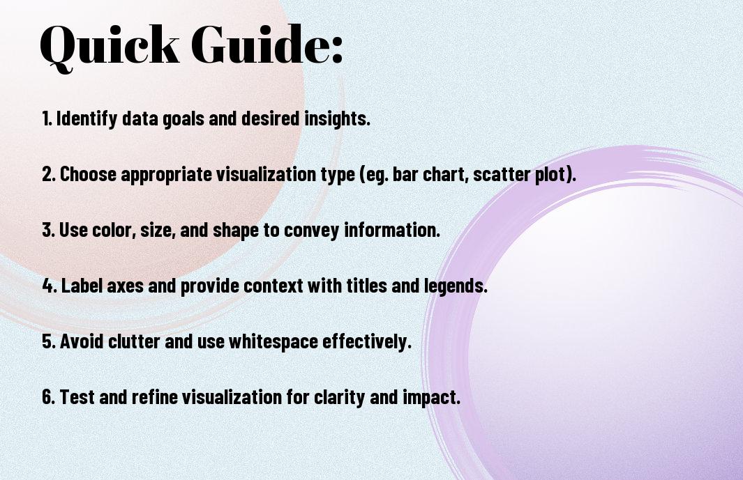
This comprehensive guide will walk you through the most effective data visualization techniques to help you present complex information in a clear and impactful way. Whether you are a beginner or an experienced data analyst, these techniques will enhance your ability to communicate insights and make informed decisions based on your data. From charts and graphs to interactive dashboards, you will learn how to choose the right visualization for your data and impress your audience with compelling visuals.
Key Takeaways:
- Data visualization is a powerful tool for making data more accessible and understandable.
- Choose the right type of visualization based on the data you want to convey – options range from bar charts to scatter plots to heat maps.
- Color choice can greatly impact the effectiveness of a data visualization – use contrasting colors for clarity and avoid using too many colors.
- Labeling is crucial in data visualization to ensure that viewers understand the data being presented.
- Integrate interactivity in your visualizations to allow users to explore the data themselves and gain deeper insights.
- Standardize your visualizations by using consistent design elements and formats across different graphs and charts for easier comprehension.
- Seek feedback from others on your data visualizations to improve clarity and effectiveness.
Types of Data Visualization Techniques
A variety of data visualization techniques are available to help you present your data in a meaningful and insightful way. Here are some common techniques you can use to visualize your data effectively:
- Quantitative Data Visualization Techniques: Represent numerical data using charts, graphs, and plots.
- Qualitative Data Visualization Techniques: Visualize non-numerical data such as text and images.
- Geospatial Data Visualization Techniques: Display data on maps and geographical locations.
- Statistical Data Visualization Techniques: Use statistical methods to visualize data distributions and relationships.
- Temporal Data Visualization Techniques: Show changes in data over time using timelines and animations.
An crucial aspect of quantitative data visualization techniques is that they help you analyze and interpret numerical data. Common techniques include bar charts, pie charts, histograms, scatter plots, and line graphs. These visualizations can reveal trends, patterns, and correlations in your data, making it easier for you to draw meaningful insights. By utilizing these techniques, you can make informed decisions and communicate your findings effectively. Assume that you want to compare sales performance across different regions, a bar chart or a map visualization can help you easily identify the highest and lowest performing areas.
Any data that is not numerical can be effectively visualized using qualitative data visualization techniques. These techniques focus on representing non-numeric data such as text, images, and videos in a visual format. Word clouds, infographics, and network diagrams are some common examples of qualitative data visualizations. You can use these techniques to uncover patterns, sentiments, and themes in your data that may not be immediately apparent. For instance, if you are analyzing customer feedback from surveys, a word cloud can quickly show you the most frequently used words or phrases, giving you insight into common customer sentiments.
Geospatial Data Visualization Techniques
The geospatial data visualization techniques involve representing data on maps and geographic locations. These techniques allow you to visualize data in a spatial context and identify patterns or trends based on location. Common geospatial visualization methods include choropleth maps, heat maps, and 3D visualizations. By using these techniques, you can gain valuable insights into the geographical distribution of your data and make location-based decisions. Techniques such as heat maps can help you identify areas with high or low concentrations of data points, while choropleth maps can show variations in data across different regions.
For more in-depth information on data visualization techniques, check out our comprehensive guide on 🔥 The Ultimate Guide to Data Visualization.
Factors to Consider When Choosing a Data Visualization Technique
Some key factors should be taken into consideration when you are deciding on a data visualization technique for your project. By carefully evaluating these factors, you can ensure that your visualization effectively conveys the insights and messages you want to communicate to your audience.
Data Size and Complexity
Techniqueone, when considering the data size and complexity of your dataset, it is important to choose a visualization method that can handle the volume of data and the intricacies of the relationships within it. For example, if you have a large dataset with multiple variables, a scatter plot or a heat map may be more suitable for highlighting trends and patterns.
Additionally, the complexity of your data will also play a role in selecting an appropriate visualization technique. For highly complex data sets, interactive visualizations such as network graphs or treemaps can help users explore the data and uncover insights in a more dynamic way.
Knowing how to balance the size and complexity of your data will allow you to choose a visualization technique that best serves the purposes of your project and effectively communicates your message to your audience.
Audience and Purpose
Little considerations should be given to your audience and the purpose of your visualization when selecting a technique. You must tailor your visualization to your target audience’s preferences and level of understanding. For example, if you are creating a visualization for a general audience, you may want to use simple bar charts or pie charts to convey your message clearly.
On the other hand, if your visualization is intended for technical experts or data scientists, you may opt for more advanced visualization techniques such as box plots or violin plots to provide in-depth insights and analysis.
Factors such as audience demographics, knowledge level, and the overall purpose of your visualization will guide you in choosing the most appropriate visualization technique that will resonate with your viewers and achieve your communication goals.
Data Storytelling Goals
To effectively convey a compelling narrative through your data visualization, you need to align your visualization technique with your data storytelling goals. If your goal is to compare different categories or show relationships, a bar chart or a line chart may be suitable.
Alternatively, if you aim to showcase hierarchical data or part-to-whole relationships, a tree diagram or a sunburst chart could be more effective in telling your data story visually.
Plus, by considering your data storytelling goals in conjunction with the type of data you have and the preferences of your audience, you can create engaging visualizations that not only convey information but also tell a compelling story that resonates with your viewers.
Step-by-Step Guide to Creating Effective Bar Charts
Keep Choosing the Right Data for Bar Charts in mind when creating effective bar charts. This aspect is crucial because the data you choose will directly impact the clarity and relevance of your visualization. Ensure that your data is clear, concise, and relevant to the message you want to convey. Use data that is easy to understand and can be visually represented effectively in a bar chart. Make sure your data is organized and structured in a way that makes the comparison easy for the audience.
| 1. Clear and Relevant Data | Ensure that your data is clear, concise, and relevant to the message you want to convey. |
| 2. Organized Data | Make sure your data is organized and structured in a way that makes the comparison easy for the audience. |
Designing Bar Charts for Maximum Impact
Some Designing Bar Charts for Maximum Impact involves paying attention to the layout and design elements that can enhance the visual appeal of your bar chart. Choose the right color scheme that is visually appealing and helps differentiate between different data sets. Use consistent labeling and make sure your axes are clearly labeled for easy understanding. Consider adding annotations or data labels to highlight key data points.
| 1. Color Scheme | Choose a visually appealing color scheme that helps differentiate between different data sets. |
| 2. Clear Labeling | Use consistent labeling and ensure your axes are clearly labeled for easy understanding. |
Impact: When designing bar charts for maximum impact, remember that the visual appeal and clarity of your chart can significantly impact how effectively your message is communicated to your audience. By paying attention to design elements, you can create a visually appealing and informative bar chart that effectively conveys your data.
Common Mistakes to Avoid in Bar Chart Creation
Common Common Mistakes to Avoid in Bar Chart Creation include using inappropriate scales, cluttering the chart with unnecessary elements, and misleading representations of data. Make sure to choose the right scale for your chart to accurately represent your data. Avoid overcrowding your chart with unnecessary gridlines or decorations that can distract from the main message. Ensure that your data is presented accurately and without any manipulation that can lead to misinterpretation.
| 1. Appropriate Scale | Choose the right scale to accurately represent your data without distorting the information. |
| 2. Avoid Clutter | Avoid cluttering your chart with unnecessary gridlines or decorations that can distract from the main message. |
It is important to note that creating an effective bar chart requires careful attention to detail. By avoiding common mistakes and following best practices, you can create visually appealing and informative bar charts that effectively communicate your data to your audience.
Tips for Creating Interactive Data Visualizations
Many data visualization tools offer interactive features that allow users to engage more deeply with the data. By incorporating interactive elements into your visualizations, you can provide a more dynamic and engaging experience for your audience. Here are some tips to help you create effective interactive data visualizations:
- Utilize hover-over text and tooltips to provide additional context and information.
- Implement filtering and drill-down capabilities to allow users to explore the data in more detail.
- Follow best practices for interactive visualization design to ensure a seamless and intuitive user experience.
Thou can use these tips to enhance your data visualizations and make them more engaging and informative for your audience.
Using Hover-Over Text and Tooltips
Visualizations that incorporate hover-over text and tooltips can provide valuable context and insights to your audience. By adding this interactive feature, you can allow users to easily access additional information by simply hovering over data points or elements in the visualization. This can help users better understand the data and make more informed interpretations.
- Hover-over text and tooltips can provide detailed information without cluttering the visualization.
- They can help users identify trends, outliers, and patterns in the data.
- By incorporating interactive elements like hover-over text, you can enhance the overall user experience and engagement with your visualization.
Any interactive data visualization can benefit from the inclusion of hover-over text and tooltips to provide users with a more comprehensive understanding of the data.
Implementing Filtering and Drill-Down Capabilities
Creating interactive data visualizations with filtering and drill-down capabilities allows users to explore the data in more depth. By incorporating these interactive features, you can empower users to interact with the data and uncover insights by customizing the information they view. This can lead to a more personalized and engaging experience for the user.
The ability to filter data based on specific criteria or drill down into subsets of the data can help users answer more complex questions and make more informed decisions. By implementing these interactive capabilities, you can make your visualizations more versatile and valuable for your audience.
Best Practices for Interactive Visualization Design
Now is the time to consider some best practices for designing interactive data visualizations. By following these principles, you can create visualizations that are not only visually appealing but also highly effective in conveying information. Some key best practices include designing for mobile responsiveness, choosing the right chart types, and optimizing performance for smooth interactions.
Another important aspect to consider is to ensure that your interactive data visualizations are accessible to all users, including those with disabilities. By adhering to accessibility standards and designing with inclusivity in mind, you can reach a wider audience and make your visualizations more impactful. Remember to test and iterate on your designs to continue improving the user experience.
The Pros and Cons of Using 3D Data Visualizations
Not all data visualizations are created equal, and 3D data visualizations have their own set of advantages and disadvantages. It’s important to weigh these factors before deciding whether to use 3D visualizations for your data analysis needs.
| Pros | Cons |
| Enhanced aesthetics | Potential for distortion |
| Engaging user experience | Complexity can lead to misinterpretation |
| Ability to show multiple variables | Difficulty in comparing values accurately |
| Stand out from traditional 2D visualizations | Not suitable for large datasets |
Advantages of 3D Visualizations: Enhanced Storytelling and Engagement
Visualizations in 3D can transform your data into captivating visual stories that hold your audience’s attention. By adding a third dimension, you can create depth and perspective that make the data more immersive and engaging. This can help you convey complex information in a more compelling way, making it easier for your audience to understand and remember the key takeaways from the data.
Furthermore, 3D visualizations can enhance the storytelling aspect of your data analysis. By adding visual elements like depth and shading, you can guide your audience’s focus to the most critical parts of the data. This can help you craft a more impactful narrative around your data, leading to better decision-making and comprehension of the insights you’re presenting.
Engaging your audience through immersive 3D visualizations can also make your data more memorable. By creating a visually stimulating experience, you can leave a lasting impression on your audience, ensuring that they not only understand the data in the moment but also retain the key points long after they’ve engaged with the visualization.
Disadvantages of 3D Visualizations: Distortion and Misinterpretation
The use of 3D in data visualizations can introduce distortion that may misrepresent the data being presented. The added dimension can make objects appear larger or smaller than they actually are, leading to inaccuracies in perception. This distortion can potentially skew the way the data is interpreted, causing misunderstandings or incorrect conclusions to be drawn.
Additionally, the complexity of 3D visualizations can sometimes lead to misinterpretation of the data. With multiple elements interacting in three-dimensional space, it can be challenging for viewers to accurately compare values or understand the relationships between data points. This can result in confusion and hinder the effectiveness of the visualization in conveying its intended message.
The potential for misinterpretation in 3D visualizations highlights the importance of careful design and consideration of how the added dimensionality may affect the way your audience perceives the data. It’s crucial to balance the aesthetic appeal of 3D visualizations with the need for accurate and clear communication of the underlying data.
It can be easy to get caught up in the allure of 3D visualizations, but it’s imperative to consider their potential drawbacks as well. The distortion and misinterpretation that can arise from using 3D elements in your data visualizations should be carefully weighed against the benefits they may provide. When deciding whether to use 3D visualizations, make sure to consider the specific characteristics of your data and the purpose of your visualization to determine if 3D is the most appropriate choice.
Mastering the Art of Color in Data Visualization
To The Ultimate Guide to Data Visualization: Time to Get Good, you need to master the art of color in data visualization. Understanding how to use color effectively can make a significant difference in how your data visualizations are perceived and understood. Color plays a crucial role in conveying information, highlighting trends, and creating visual appeal. Let’s examine into the fundamentals of color theory for data visualization.
Color Theory Fundamentals for Data Visualization
Assuming you’re not familiar with color theory, here’s a brief overview to get you started. Color theory is the study of how colors interact with each other. It involves understanding the color wheel, color harmonies, color contrast, and the psychological effects of different colors. When creating data visualizations, you should consider factors such as color temperature (warm vs. cool colors), color brightness, and color saturation. Choosing the right color scheme can enhance the readability and comprehension of your visualizations.
Choosing the Right Color Palette for Your Data
Data visualization experts recommend using color palettes that are visually appealing and accessible to all audiences. A good color palette should consist of colors that are easily distinguishable and convey the intended message effectively. When selecting colors for your visualization, consider factors such as color blindness, cultural connotations of colors, and the emotional impact of different hues. Using a diverse color palette can help you differentiate between data categories and draw attention to key insights.
Data visualization tools often provide pre-built color palettes or allow you to create custom color schemes. Experiment with different color combinations to find the one that best suits your data and the story you want to convey. Do not forget, consistency is key when it comes to using colors in data visualizations. Avoid using too many colors or hues that are too similar, as this can lead to confusion and misinterpretation of the data.
Avoiding Common Color-Related Mistakes
Mastering color in data visualization also involves avoiding common mistakes that can undermine the effectiveness of your visualizations. One common mistake is using colors that are too bright or saturated, which can be overwhelming and distract from the data. Another pitfall is using red and green together, as these colors are difficult to differentiate for colorblind individuals. Choosing an accessible color palette and testing your visualizations for color blindness can help you create inclusive designs.
For instance, consider using color gradients or shades of a single color to represent data variations instead of using multiple unrelated colors. Be mindful of the background color you choose, as it can affect the readability of your visualizations. By paying attention to these details, you can ensure that your data visualizations are not only visually appealing but also easy to understand and interpret.
Step-by-Step Guide to Creating Effective Scatter Plots
Preparing Your Data for Scatter Plot Analysis
For preparing your data for scatter plot analysis, you first need to ensure that you have two sets of variables that you want to compare. These variables should be numerical and ideally show some kind of relationship or correlation. It is crucial to clean and organize your data properly before creating a scatter plot to ensure accurate results. Remove any outliers or missing values that could skew the interpretation of the plot.
| Step 1: Organize your data | Step 2: Check for outliers and missing values |
| Step 3: Select the appropriate variables | Step 4: Define the x and y-axis |
Designing Scatter Plots for Insights and Trends
For designing scatter plots for insights and trends, you should carefully consider the visualization of your data. Choose the right type of scatter plot for your analysis, such as a linear scatter plot for identifying trends or a clustered scatter plot for comparing multiple groups. Pay attention to the size, color, and shape of the markers to convey additional information.
| Step 1: Choose the appropriate type of scatter plot | Step 2: Customize the markers for better visualization |
| Step 3: Add labels and a legend for clarity | Step 4: Include a trendline for better understanding |
Plus, consider adding annotations to highlight specific data points or trends in your scatter plot. This can provide additional context and insights for your audience, making it easier for them to interpret the data and make informed decisions based on the visualization.
Interpreting Scatter Plot Results for Data-Driven Decisions
Scatter plot results for data-driven decisions can help you identify patterns, correlations, and outliers in your data. Look for clusters of data points, trends in the scatter plot, or any unexpected relationships that could indicate a cause-and-effect relationship. Use regression analysis or correlation coefficients to quantify the strength of the relationship between the variables.
| Step 1: Analyze clusters and outliers | Step 2: Calculate correlation coefficients |
| Step 3: Perform regression analysis if necessary | Step 4: Make data-driven decisions based on the insights |
Analysis: By interpreting scatter plot results effectively, you can make informed decisions for your business, identify areas for improvement, and predict future trends based on the relationships between variables in your data.

Factors to Consider When Visualizing Time-Series Data
Now, when visualizing time-series data, there are several factors you need to consider to ensure that your visualizations are accurate and effective. Some of the key factors include the handling of irregular time intervals and missing data, choosing the right time-series visualization type, and avoiding common pitfalls in time-series visualization. By carefully considering these factors, you can create visualizations that provide valuable insights into your data.
- Handling irregular time intervals and missing data
- Choosing the right time-series visualization type
- Avoiding common pitfalls in time-series visualization
Handling Irregular Time Intervals and Missing Data
There’s a common challenge in time-series data where the time intervals between data points are irregular, or there are missing data points. When visualizing this type of data, it’s imperative to handle these irregularities appropriately to prevent misleading interpretations. One approach is to interpolate the missing data points to create a more continuous visualization. Alternatively, you can choose to represent the data with a method that explicitly shows gaps in the timeline. By carefully considering how to handle irregular time intervals and missing data, you can ensure that your visualizations accurately reflect the underlying patterns in your data.
Choosing the Right Time-Series Visualization Type
Type. When selecting a visualization type for your time-series data, it’s crucial to choose a format that best represents the patterns and trends you want to communicate. Common types of time-series visualizations include line charts, bar charts, and area charts. Line charts are ideal for showing trends over time, while bar charts are useful for comparing values across different time periods. Area charts can be effective for illustrating cumulative changes in data over time. By selecting the right visualization type for your specific data set, you can create visualizations that effectively convey your intended message.
There’s a wide range of time-series visualization types to choose from, each with its strengths and weaknesses. Some visualization types may be better suited for displaying continuous data, while others may be more suitable for highlighting seasonal patterns or outliers. Consider experimenting with different visualization types to see which one best highlights the patterns and trends in your time-series data. By selecting the most appropriate visualization type, you can ensure that your audience can easily interpret and understand the insights from your data.
Avoiding Common Pitfalls in Time-Series Visualization
Visualization. When visualizing time-series data, there are several common pitfalls to avoid to ensure that your visualizations are accurate and informative. One common mistake is extrapolating trends beyond the available data, which can lead to misleading conclusions. Another pitfall is using overly complex visualizations that make it difficult for viewers to interpret the data effectively. Additionally, failing to provide context or labels for your visualizations can make it challenging for the audience to understand the data being presented. By being aware of these common pitfalls and taking steps to avoid them, you can create time-series visualizations that effectively communicate insights from your data.
Consider the importance of providing context, choosing appropriate visualization types, and accurately representing your data when visualizing time-series data. By paying attention to these factors and avoiding common pitfalls, you can create visually compelling and informative visualizations that help your audience understand the patterns and trends in your data. Remember that the goal of time-series visualization is to make complex data more accessible and understandable, so prioritize clarity and accuracy in your visualizations.
Tips for Creating Effective Heatmaps and Treemaps
All data visualization experts know that heatmaps and treemaps are powerful tools for interpreting complex data sets. Here are some tips to help you make the most of these visualization techniques:
- Consider the audience: Before creating a heatmap or treemap, think about who will be viewing it and what they need to understand from the data. Tailor the design and color schemes to cater to their specific needs.
- Keep it simple: Avoid cluttering the visualization with unnecessary elements. Focus on presenting the most important patterns and insights clearly and concisely.
Knowing how to effectively design and color your heatmaps and treemaps can significantly impact the way your audience interprets the data.
Designing Heatmaps for Pattern Detection and Insights
To design effective heatmaps for pattern detection and insights, consider the message you want to convey and choose colors that highlight the relevant information. Group similar data together and use color gradients to show variations clearly. Pay attention to the legend to ensure that your audience can easily interpret the colors used in the heatmap.
Using Treemaps for Hierarchical Data Visualization
Visualization experts often use treemaps to represent hierarchical data structures. With treemaps, you can easily visualize the proportions of each category within a hierarchy. This visualization technique is particularly useful when you need to compare different levels of a hierarchy and understand the overall composition of the data.
Treemaps provide a unique way to display hierarchical data, allowing you to see the relationships between categories at a glance. By utilizing different colors and sizes for each category, you can effectively communicate complex hierarchical structures in a visually appealing manner.
Best Practices for Heatmap and Treemap Color Schemes
Heatmap color schemes play a crucial role in highlighting patterns and trends in the data. Choose a color palette that is easy on the eyes and conveys the intended message clearly. Avoid using harsh color combinations that can be distracting or difficult to interpret.
Insights from data visualization experts suggest that using a sequential color scheme for heatmaps can help show a progression or trend effectively. By assigning colors based on the intensity of the data values, you can guide your audience’s interpretation and make it easier for them to draw meaningful insights. Be mindful of, the goal of using color in heatmaps and treemaps is to enhance understanding and facilitate data-driven decision-making.
The Pros and Cons of Using Infographics for Data Visualization
After researching the topic of using infographics for data visualization, it is important to understand the various pros and cons associated with this popular technique. By breaking down the advantages and disadvantages into a clear table format, you can make an informed decision on whether infographics are the right choice for your data visualization needs.
| Advantages | Disadvantages |
| Visual appeal | Potential for information overload |
| Effective storytelling | Possibility of data distortion |
| Easy to share on social media | May not be suitable for complex data sets |
| Engages audience quickly | Requires design skills or tools |
Advantages of Infographics: Visual Storytelling and Sharing
Infographics are powerful tools for visual storytelling, allowing you to convey complex data in a format that is easy to understand and engaging for your audience. By combining text, images, and charts, you can create a compelling narrative that captures the viewer’s attention and delivers key messages effectively.
Another major advantage of infographics is their shareability on social media platforms. With their visually appealing design, infographics are more likely to be shared and reposted by users, increasing the reach of your data visualization efforts and driving more traffic to your content.
Furthermore, infographics help you stand out in a sea of text-based content online. By presenting information in a visually appealing way, you can attract and retain the attention of your audience, making your data more memorable and impactful.
Disadvantages of Infographics: Information Overload and Distortion
While infographics have their benefits, they also come with drawbacks that you need to consider. One such disadvantage is the potential for information overload, where too much data or too many design elements can overwhelm the viewer and detract from the key messages you want to convey.
There is also a risk of data distortion in infographics, especially if not properly curated or designed. Distorting data can mislead your audience and undermine the credibility of your visualizations, so it is crucial to ensure accuracy and clarity in your infographics.
Additionally, infographics may not be suitable for presenting highly complex data sets that require detailed analysis and interpretation. If your data is intricate and requires in-depth explanation, other visualization techniques may be more appropriate for effectively communicating your findings.
When to Use Infographics Effectively
Despite the potential drawbacks, infographics can be highly effective tools for data visualization when used appropriately. You should consider using infographics when you want to simplify complex information and make it more digestible for your audience. By breaking down data into visual chunks, you can enhance understanding and engagement with your content.
Infographics are also ideal for summarizing key points or trends in your data, allowing you to highlight the most important insights for your audience. Whether you are presenting research findings, marketing data, or educational content, infographics can help you communicate your message more effectively and memorably.
Moreover, infographics are best suited for presenting data that lends itself well to visual representation, such as statistics, comparisons, or timelines. If your data can be transformed into compelling visuals that enhance understanding and retention, infographics may be the right choice for your data visualization needs.
Step-by-Step Guide to Creating Effective Geospatial Visualizations
Preparing Your Geospatial Data for Visualization
While preparing your geospatial data for visualization, the first step is to ensure that your data is clean and accurate. You need to check for any missing or erroneous values, duplicate entries, or inconsistencies in the data. Creating a clean dataset is crucial for accurate geospatial visualizations.
Next, you need to format your data appropriately for the type of visualization you want to create. This may involve converting addresses to latitude and longitude coordinates, aggregating data at different geographic levels, or standardizing naming conventions for locations. Properly formatted data will make it easier to create meaningful geospatial visualizations.
Choosing the Right Geospatial Visualization Type
On choosing the right geospatial visualization type for your data, consider the purpose of your visualization. Are you trying to show spatial patterns, relationships between locations, or changes over time? Different types of geospatial visualizations, such as choropleth maps, heatmaps, or flow maps, are suitable for different purposes. Selecting the appropriate visualization type will help you effectively communicate the insights in your data.
When choosing a geospatial visualization type, also consider the complexity of your data and the story you want to tell. For more detailed data, a choropleth map with color gradients may be more appropriate, while for simple location comparisons, a symbol map with markers may be sufficient. Matching the visualization type to your data will enhance the clarity and impact of your geospatial visualizations.
Designing Geospatial Visualizations for Insights and Trends
Trends play a key role in designing geospatial visualizations for insights and trends. By identifying patterns over time or across regions, you can uncover valuable insights from your geospatial data. Visualizing trends through animations, time sliders, or small multiples can help you analyze data dynamics and convey meaningful stories.
When designing geospatial visualizations, consider the audience you are targeting and the key messages you want to convey. The use of colors, scales, and annotations can help highlight important trends or patterns in your data. By designing clear and informative geospatial visualizations, you can ensure that your audience understands and engages with the insights you provide.
Factors to Consider When Visualizing Big Data
Many factors should be taken into account when visualizing big data to ensure the effectiveness of the visualization. Here are some key considerations:
- Data Size: The sheer volume of the data can impact the choice of visualization techniques. You need to consider how to effectively represent huge datasets without overwhelming the viewer.
- Data Complexity: Complex datasets may require advanced visualization methods to uncover patterns and insights. Understanding the nature of your data is crucial for selecting the right visualization approach.
- Performance: Ensuring smooth performance is vital when dealing with big data visualization. Slow rendering or outdated information can lead to misinterpretation of data.
Perceiving the nuances of big data visualization is vital to extract valuable insights from vast amounts of information.
Handling Large Datasets and Performance Issues
You must optimize your visualization techniques to handle large datasets and mitigate performance issues. Consider techniques like data aggregation, sampling, or implementing interactive features to navigate through massive amounts of data. Prioritize data preprocessing to streamline the visualization process and improve performance. Utilizing scalable technologies and tools can also help enhance the visualization experience for big data.
Choosing the Right Big Data Visualization Tools and Technologies
When identifying the right tools and technologies for big data visualization, consider factors such as scalability, compatibility with your data sources, and the ability to handle real-time data. Ensure that the tools you choose offer advanced features like interactivity, dynamic updates, and support for multiple data formats. Look for robust platforms that can accommodate the volume and complexity of your data while providing flexibility for customization and integration with other systems.
Choosing the appropriate big data visualization tools and technologies is crucial for effectively presenting and analyzing large datasets. Platforms that offer comprehensive functionalities and a user-friendly interface can empower you to explore data insights efficiently and make informed decisions based on the visual representations.
Avoiding Common Pitfalls in Big Data Visualization
You can enhance the effectiveness of big data visualization by avoiding common pitfalls such as:
- Overcrowded Visuals: Cluttered visualizations can confuse the viewer and hinder data interpretation. Simplify your visuals by focusing on the most relevant information.
- Ignoring Data Quality: Inaccurate or incomplete data can lead to misleading visualizations. Ensure data quality and validity before creating visual representations to maintain credibility.
- Choosing Style over Substance: While aesthetics are important, prioritize data relevance and clarity in your visualizations. Balancing style with substance maximizes the impact of your visualizations.
Consider these factors to optimize your big data visualization strategy and unlock the true potential of your data insights.
Tips for Creating Effective Animated Data Visualizations
For creating effective animated data visualizations, there are several tips that can help you make the most impact with your visual storytelling. Here are some key considerations:
- Use subtle animations to draw attention to the most important data points.
- Make sure your animations are smooth and not distracting from the data.
- Consider the timing of your animations to ensure they enhance the understanding of the data.
Knowing how to effectively use animations in your data visualizations can help engage your audience and make your data more understandable. For more tips on data visualization techniques, check out A Complete Beginner’s Guide to Data Visualization.
Using Animation to Enhance Data Storytelling
Clearly, animation plays a crucial role in enhancing data storytelling. It helps in guiding the viewer’s focus to the most important data points, making complex data easier to comprehend. By using animations judiciously, you can create a narrative flow that guides the viewer through the story your data is telling.
Designing Animated Visualizations for Maximum Impact
Animated visualizations make your data come alive, creating a more engaging and memorable experience for your audience. By carefully considering the design elements such as color, layout, and typography, you can enhance the visual appeal and effectiveness of your animations.
Visualizations that are designed well not only enhance comprehension but also leave a lasting impression on the viewer. By paying attention to the details of your animated visualizations, you can create impactful and meaningful stories with your data.
Best Practices for Animated Visualization Design
Impactful animated visualizations are user-friendly, engaging, and effective in communicating insights. By following best practices such as simplicity in design, consistent use of animations, and consideration of your audience, you can ensure your visualizations have the maximum impact on your viewers.
Designing animated visualizations that are well-received requires a balance between creativity and clarity. By testing your animations with different audiences and soliciting feedback, you can continuously improve the effectiveness of your visualizations.
To wrap up
With this in mind, you now have a comprehensive understanding of various data visualization techniques and how they can be applied to enhance your data analysis and presentation skills. By choosing the right type of visualization for your data, you can effectively communicate your insights and findings to others in a clear and concise manner. Whether you are working with simple datasets or large, complex data structures, the techniques outlined in this guide can help you make sense of your data and extract valuable information.
Remember to always consider your audience and the message you want to convey when selecting a visualization technique. By keeping your goals in mind and utilizing the appropriate tools, you can create engaging and informative visualizations that capture the attention of your viewers. Experiment with different types of charts, graphs, and diagrams to find the best way to represent your data and tell your story effectively.
Ultimately, mastering data visualization techniques is a powerful skill that can elevate your analyses and presentations to new heights. By following the tips and guidelines provided in this guide, you can become more proficient in creating impactful visualizations that make your data more accessible and understandable. So, go ahead and start practicing these techniques in your next project, and watch as your data comes to life in ways you never thought possible.